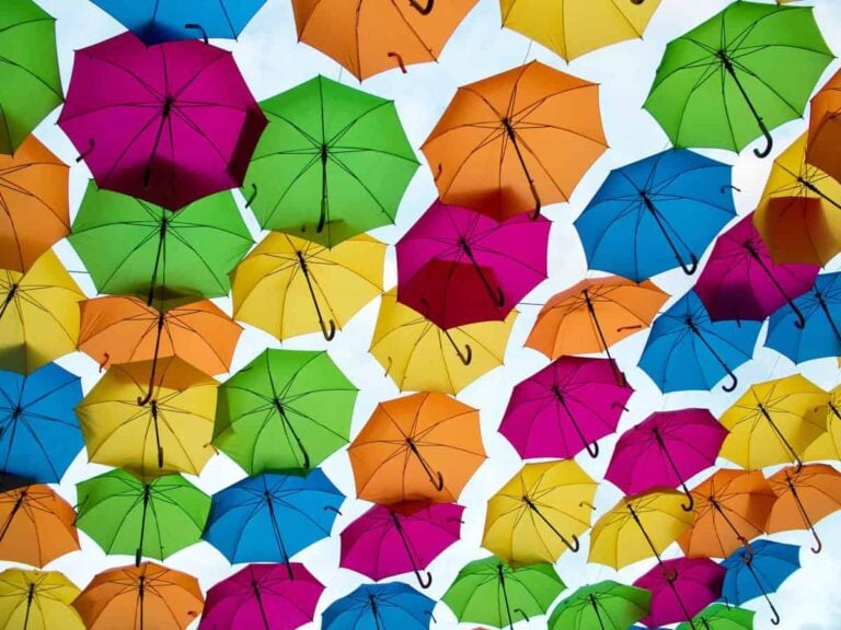
As designers, we’re all conscious of colour, and the potential psychological effect it can have on a consumer’s choice.
It’s no secret that certain colours elicit a pre-programmed response in us, which is why it’s so important to get the colour right in every aspect of communication from logo to packaging to website design.
We only have to look at popular brands to determine what kind of response they expect us to have: the bold red of Netflix’s logo elicits excitement and passion. The yellow ‘golden arches’ of McDonalds, on the other hand, suggest sunshine, positivity and happiness. It’s not surprising that eco-driven brands such as Whole Foods, the Vegetarian Society and Greenpeace often choose earthy, green iconography.
When we start to combine colours together, our reactions change accordingly. Put a warm yellow and black together and you move from sunny radiance to a potential hazard sign ingrained in our thinking by Mother Nature, which has shown us to beware of wasps and bees bearing the same livery. These associations are often described as colour psychology, but actually they are colour symbolism – conscious associations that we are conditioned to make. While most brands understand that the colours they choose to represent them can affect the consumer’s interpretation and thus influence their decision-making, very few treat real colour psychology with the scientific validity it deserves.
It wasn’t until I was introduced to colour psychologist, Angela Wright, when working on a project for our client, Shell, that I really understood the true science behind colour, which she is credited with uncovering. Angela did not believe that something as fundamental to life as light, and its relationship with humanity, could possibly be random, so she set about looking for underlying patterns and, after many years, uncovered the mathematics underpinning objective colour harmony (you can read more about her discovery on Angela’s website – it’s mind-bending stuff). From this breakthrough, she went on to develop the Colour Affects System – four colour families, within which every colour naturally harmonises with every other colour in the family.
Suddenly, combining colours became a lot more complicated – but a lot more effective. There are eleven basic colours, each of which can be broken down into various shades, so you could be forgiven for thinking that selecting colour combinations is simply a matter of finding two colour variants that work together. But if you want true harmony, you need to go a stage further. We tend to think of certain colours as warm or cold. In fact, what Angela discovered, is there are four distinct subgroups – morninglight, dreamlight, firelight and starlight – each representing a different personality type based on the natural patterns of light. Across the groups you have different shades of the same colours. Only by combining multiple colours from within the same group can you create true colour harmony. It’s the equivalent of selecting the right key for a symphony.
The results were immediate for Shell. After deciding which of the four aspects of light best represented the brand’s personality and ethos, colour combinations from within the same group were chosen. It became immediately clear that they worked better together than when we had been cross-pollinating across groups and put a stop to the long, subjective arguments about colour. The result, however, is that I now find myself unable to look at a brand identity without questioning its colour combination.
Take the HSBC logo, for example: it combines black, a starlight colour, with an intense firelight red, which I find quite harsh on the eyes. Both the eBay and Google logos, which feature multiple primary colours, are out of harmony, cross-pollinating across two or more colour groups. PWC’s colour palette looks to me as though it’s deliberately meandering through every aspect of light. And perhaps it is actually deliberate but I doubt it. It’s possible (but unlikely) that some brands are aware of the true science behind the psychology of colour and have decided that, as disruptors, they don’t want to express harmony; they want to elicit a more jarring response.
A colleague and I were debating which light group the orange and purple in the FedEx logo sat within. Whether we interpreted it as morninglight or firelight, we both agreed that the combination felt harmonious. When I flick through a Pantone swatch, it feels harmonious, and I suspect they have categorised the order of colours in correlation with the aspects of light – but as specialists in this area, I don’t know if that’s deliberate or just the result of an innate understanding of colour. I think the point is that, selecting colours from within one light group is one of those things that, when done correctly, you don’t necessarily notice. But when a brand gets it wrong, not only does it jar and spoil the design; worst case scenario, an inharmonious logo can unconsciously communicate a negative message to the world, contradicting everything the brand stands for.
That’s worth bearing in mind next time you’re creating a visual identity. We’re only talking about a slight tweak but one that could improve the relationship between the colour combinations of many a corporate logo to achieve a more harmonious, positive design.

