To persuade is to influence. We humans are hardwired to persuade others and somehow influence their action or behavior. It is an innate sense that is triggered whenever we find ourselves either engaged in a battle of wits or in something as trivial as stopping a child from picking his nose.
Persuasion in action is widely observed in marketing, be it traditional or digital. Marketers use the power of psychology to touch the right string and trigger the right emotion to influence the customers’ intentions or behaviors.
The psychological triggers marketers usually play with are scarcity, reciprocity, anchoring, and social proof among many other.
But the question remains, can those cognitive techniques be applied to web design?
Certainly, you can!
In this post, we attempt to dive deep into persuasive web design rules. We will also see with examples how those rules can actually deliver the desired results, i.e., engagement and conversions.
See also: web design Leicester for more information about website design.
Anchor visitors by placing reference clues
If define in a single word, anchoring is comparing.
Our mind works in complex ways. When we are presented with a high figure and then a lowest figure is introduced, the drastic change in values influences our decision.
Take for instance the unveiling of the iPad by Steve Jobs. He introduced the amazing features of the iPad and constantly tagged buzzwords with every feature. However when it came to the price, he said, “If you listen to the pundits, we’re going to price it at under $1000, which is code for $999.” The ridiculous price stunned the audience, until Steve Jobs revealed, “I am thrilled to announce to you that the iPad pricing starts not at $999, but at just $499.”
The $499 tag for the iPad seemed inexpensive, only because the audience was comparing it with the reference point, i.e., $999. This is called anchoring effect.
The same principle can be applied to a web design for better conversions. You can place visual reference cue(s) on your website and let your audience compare it with the subsequent trigger.
The best example we can derive from the World Wide Web is an Ad by Saatchi & Saatchi that Cordaid – a development aid organization – used for generating donation. Cordaid strategically placed a visual reference cue on the ad, i.e., the €32 and set the donation against it.
Use the mystical power of scarcity
If you want your web visitors to act instantly, make them realize what they are missing out on.
Scarcity is a guaranteed marketing trigger that makes people act instantly. The psychology of scarcity works on the phenomenon of “Loss Aversion”, according to which, people tend to take loss more seriously than gain.
Take for instance the profiting in stock market. There is no doubt that you will feel great delight if you make money in the stock market. However, if you lose money, you will feel greater pain than the pleasure you felt when gaining.
Therefore, it is certain that people are highly sensitive to loss than gain.
Other than the stock market example, you can observe scarcity in action when dealing with salesman as they are the best practitioner of this psychological trigger.
Another great example of scarcity on a website can be seen on ecommerce platforms as they have more room to practice it.
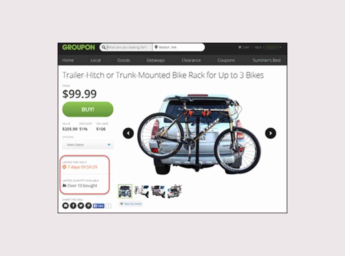
Groupon uses the scarcity of Time and Product Quantity to attract the visitors, and make them take actions promptly.
Reciprocity makes visitors return you favours
As a human, we have the tendency to return favors, the goodwill or the kindness that others show to us. And even if we don’t return the favor, we most definitely develop respect of the person for the favor he done to us.
Take the example of reciprocity from our own experience at hotels or restaurants. Even though it is the responsibility of the server to serve us and make us feel comfortable, we take his pleasant behavior as a good deed and try to return the kindness with a tip.
Marketers constantly use this psychology principle to urge customers or potential leads to take action, or at least form a positive opinion.
The principle of reciprocity, in the same way, can be applied to web designs and give users something without asking for anything.
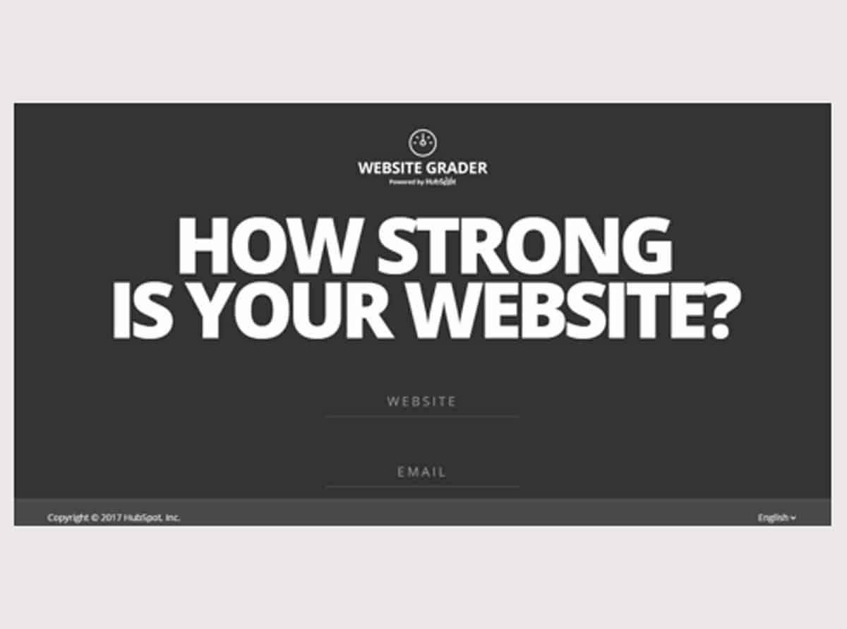
In the above example, HubSpot Website Grader uses the principle of reciprocity. The tool allows users to get a decent idea of where their website stands in terms of SEO, mobile optimization, blogging, etc.
Incite actions referencing other’s behavior
How many times you have checked out a restaurant, a bar or hotel when a friend of yours referred it to you? Probably a hundred of times…This is called social proof which is pretty apparent in our daily life.
In fact, we see majority of websites using social proof to persuade the potential buyers that if others are buying a product and satisfied with it, why don’t you.
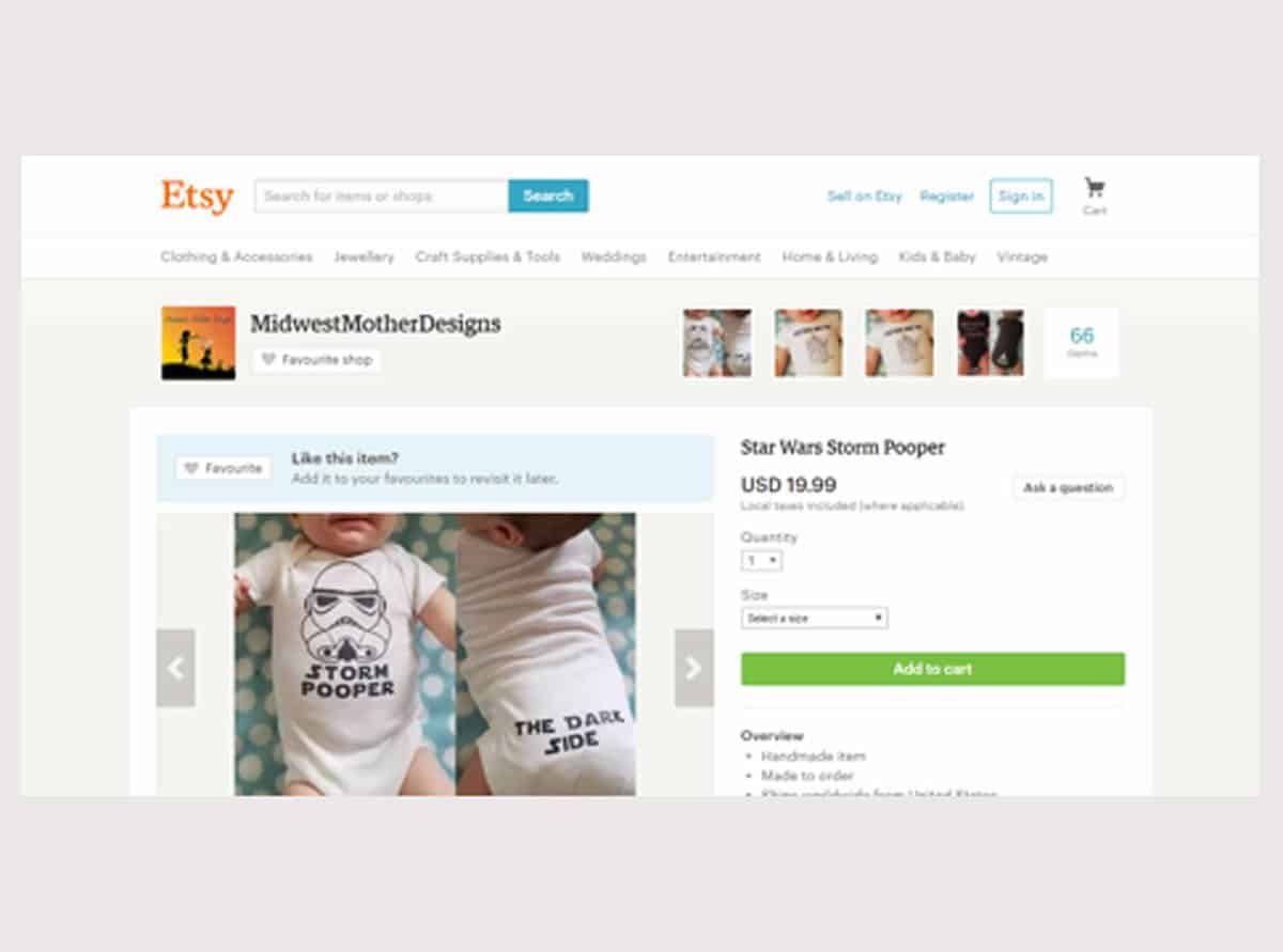
In the above example, we see Etsy employing the social proof principle by providing customers’ reviews with every product.
However, social proof should be used strategically since it is a double-edge sword. After all, if the review is weak or poor, it would lead to poor conversions.
Wrapping up
Hope the above mentioned pointers have jolted your inner psychologist into attentiveness. The key to effective implementation of these psychological triggers into your web design is research. So, know your audience first and understand how you can tweak these pointers and make the most from it.


