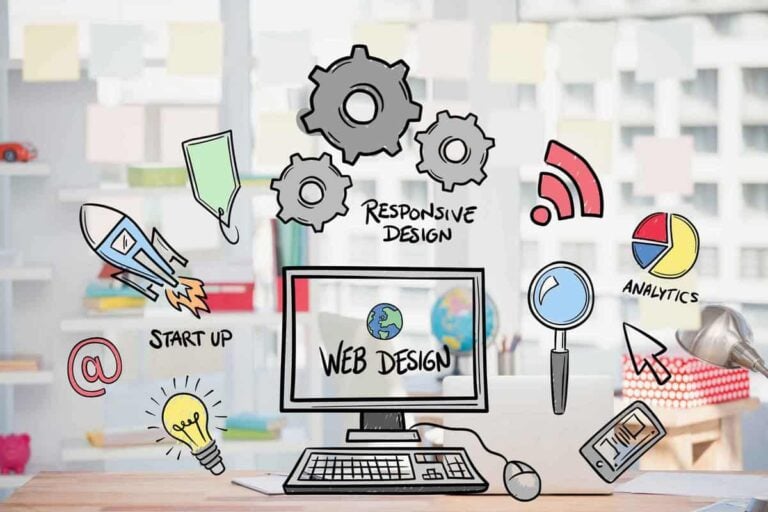
As the digital face of your organisation, your website is a key component of your marketing strategy. But merely having one won’t nearly cut it, because the potential it holds will only be unveiled with spectacular web design. So, what makes some websites better than others?
A website may look pretty, but it can absolutely fail to fulfil its purpose – and the ultimate purpose of every website is to convert visitors to customers (or subscribers).
The insights, processes, and tasks prior to conversion – the first impression of the website, navigating its pages, finding the necessary information, etc. – are all part of the potential customer’s experience with your site. The quality of that experience largely determines the chances of conversion.
In order to ensure a website provides the best experience possible and helps users establish trust in the brand, web designers carefully weigh each design decision, leaving nothing to chance. From the colour palette to the specific placement of each and every element, good web design entails psychology. Here is how great websites are designed with psychology and user behaviour in mind.
Guiding the visitor’s focus
With attention spans incredibly low, your website needs to be designed in a way that will maintain the viewer’s attention and guide their focus to where you want it. It all starts with the layout – no matter how great or catchy your content is, without clever placement, it will be just skimmed over and easily forgotten.
That’s why web designers craft web pages to mirror our viewing patterns. Research has shown that the “F” pattern works best for pages heavy with text because it corresponds with how readers scan the content. To correspond with user behaviour and eye-scanning patterns of webpages, it’s best to have your most important information on the top left, middle, and bottom right.
Next, in order to guide focus, you need to leave some empty space – whitespace, that is. This does two things. Firstly, it relieves the viewer of anxiety as the page has enough breathing room and doesn’t look visually overwhelming. Secondly, it provides so-called “visual breaks” which point the user to where you want them to focus. There’s a lot of power in the empty space, and without it, even your most attention-grabbing elements wouldn’t be able to come into focus.

The psychology of colour
It’s well-known that colours have tremendous power of evoking feelings – and which ones you will choose for your web design depends on the feelings you want to elicit. But first and foremost, the colour palette of your website should present an extension of your branding efforts and be consistent with the brand identity. That’s the starting point, and from there, you want to rely on the psychology of colour to convey your message powerfully and create positive associations with your brand.
For example, Facebook’s blue is no coincidence – the widely popular colour, with the deep hue, is associated with loyalty, trust, and tranquillity.
The power of typography
What do you think of when you see the Comic Sans font?
Personally, I think of children, kindergarten, and people who are entirely new to fonts. The font has become the joke of the internet – you just can’t use that if you actually want to be taken seriously in any way.
Having become widely ridiculed and making everyone who uses it look like a dunce, Comic Sans is a classic example of how typography adds to the message in an intangible way.
In other words, your choice of typeface depends on the tone you want to set. Sans-serif fonts have ruled the web for a long time because they imply a clean minimalist aesthetic that sets a contemporary tone. But Serifs are back, once again appreciated for their undertone of authority and seriousness. You might also notice a lot of websites lately using big, bold fonts to convey a powerful and concise message.

Earning trust
A successfully designed website helps establish a relationship between the visitor and the brand – a relationship that is primarily based on trust. Earning trust is, after all, one of the key goals of your website, because visitors need to feel you’re trustworthy in order to convert.
You’ve seen how colours and typography can be used to help establish trust. A website designed to the highest standards goes a long way inearning the visitor’s trust, whereas a cheap-looking site with randomly designed elements definitely won’t make you look good – no matter how good the content might be. Remember, your website is your most valuable representative.
Here are some more ways a website helps establish that relationship with the visitor:
- Images: High-quality, relevant images are used to help reinforce your message, evoke certain emotions, and humanize your brand.
- Home page video: It’s even more powerful than images, and it’s especially convincing when you show real, human faces. But modern-day standards for video production quality are exceptionally high, so it’s better to take your time and find a reputable digital agencyto produce your videos. Amateur videos will make your business look, well – amateur.
- Contact info clearly visible: Not only is this necessary for doing business, but it shows professionalism and dedication to the customer at first glance.
- Friendly copy: When you speak directly to the visitor, using pronouns such as “your” and “our”, you’re forming that connection and humanizing the visitor’s interaction with the machine.
- Enabling interaction: Through comments, reviews, and social share buttons, you’re giving your visitors a voice. Your website becomes a two-way communication channel that they can actively participate in, which not only makes them stay there longer, but certainly helps them associate your brand with positive feelings.
Psychology lies at the core of website design – and the best designers are always eager to delve into it. It’s especially important for business owners to gain some insight into these facts so that they can communicate well with the experts they hire to craft their website. In the end, one truth stands above all: Great web design guides the visitor unobtrusively.

